Recreating my Site as a 90s Webpage
Over the past 17 years, I’ve worked as a software engineer and manager, building some of the world’s favorite consumer products like Uber, Uber Eats, and LinkedIn.
Even though I moved to engineering management in 2011, I still love to code and continue to work on side projects and even at work.
My first time “coding” was during the early days of the web using HTML and Javascript. I fondly remember putting together my personal website back in 1996, hosted by flash.net. That site is long gone, but the Internet Archive has a record of a site I created in 1999.
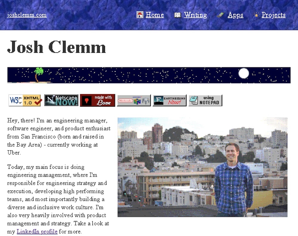
So I decided to create a homage to that past and make a 90s version of my home page.
Inspiration
I have nostalgia and fondness from those early days of the web. I love that the Space Jam movie website still exists and of course, loads super quickly. Modern javascript frameworks are powerful but often overkill.
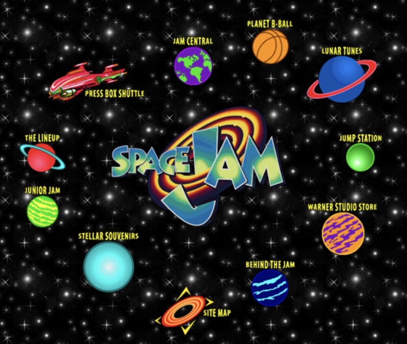
Space Jam 1996
To inspire the 90s version of my homepage, I looked at the Web Design Museum, the Space Jam website, the Yahoo site from 1997, and my own website memories and on the wayback machine.
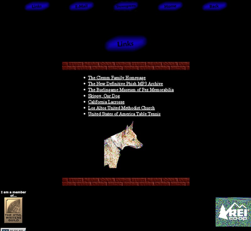
My personal links page from 1999
Gifs and Web Badges
No retro site is complete without blinking text, flashing gifs, and those tiny web badges to mark your personality.
Here’s a few resources I used for that.
- GifCities, the Animated GIF Search Engine hosted by the Internet Archive

- 99 Gif Shop, for even more inspiring animated gifs
- The 88x31 GIF Collection, an archive of those famous retro web badges


- Cameron’s World, an experience of the 90s in itself. Do yourself a favor and give it a click through!
- Free website hit counter

Pixelated Fonts
Things were looking good, except that the font rendering itself looked much too modern and smooth. “Old” fonts like Times New Roman render much nicer today using high resolution screens and antialiasing.

We're not tricking anyone with these super crisp and smooth fonts
We needed to actually create a retro-looking version of Times New Roman. For this, I found a great resource that looked into creating convincing-looking 90s fonts in modern browsers. After bringing over those font packages, the site really took on that retro feel.
Retro Looking Images
The final piece of my 90s homepage conversion was to make sure the pictures had that retro look. With today’s fast internet speeds and high resolution monitors, pictures look fantastic. But in the 90s, monitors were older and speed was a luxury. So images were a fraction of the size and often were pixelated.
So how should I pixelate my pictures?
We can emulate the older look by adding random noise, a technique known as Dithering. For this project, I found the Dither Me This tool using the “RBG Dither” option to really work nicely.
You then get photos that look like this:

We’re Done!
Now, go check out the 90s version of joshclemm.com. I’d love to see you create your own retro site one day too. Thanks!
