Border Wait gets mini UI overhaul
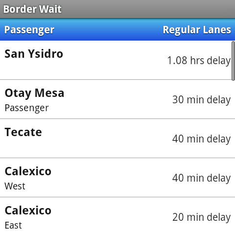
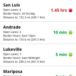 Border Wait was my first Android app and it showed - basic ListView, simple icons, and a launcher icon I found from the web.
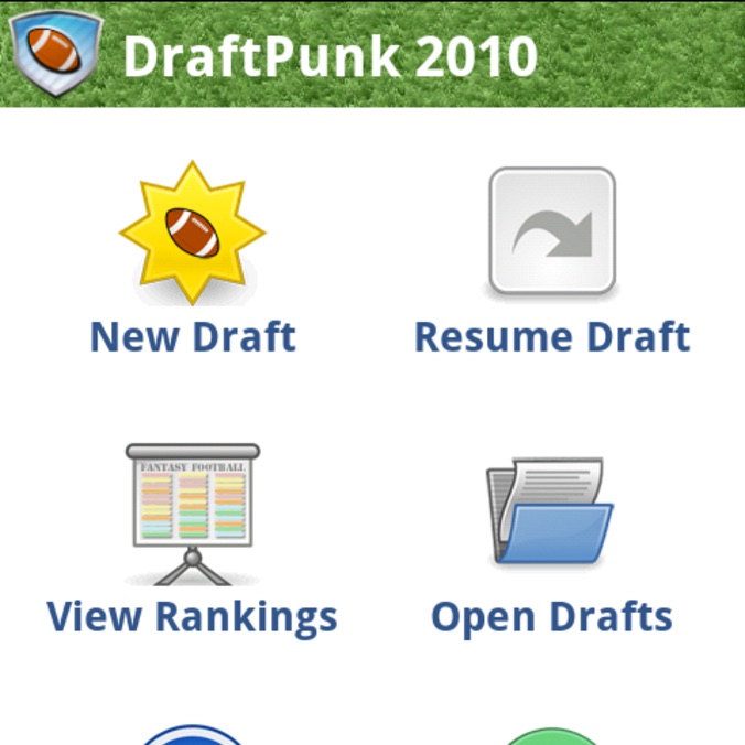
For my fantasy football app Draft Punk, I used a number of new UI patterns I had seen in the official Twitter App and read on the Android Developer’s blog including the dashboard and action bar. The result was my best looking app to date and a number of positive user reviews mentioning the interface and graphics.
So after finishing Draft Punk, it was time to revisit the look, feel, and graphics of Border Wait.
Action Bar
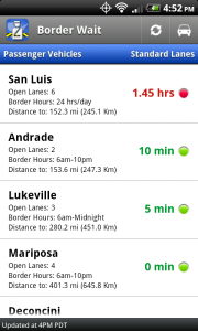
The first update was to add an action bar (as seen in my Draft Punk app, the official Twitter app, and the Facebook app) and populate it with more common icons: refreshing the list and toggling between passenger, commercial, and pedestrian lanes. Before getting to these buttons would have required first selecting the menu.
Updated List Row Layout
The old Border Wait just listed all the closest borders to your location and their delay time. Although that’s the most important piece of information for the users, there was really no need to show 7-10 borders on one screen. At any given time, you are only concerned with those within a reasonably driving distance (for many areas of the US, there is only one border within reason), so I found the opportunity to increase the height of each row.
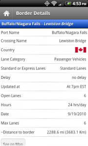
With this new height, I decided to add some other common details for that border crossing - namely the border’s hours, the number of open lanes, and the approximate distance to that border.
New Custom Launcher Icon
I was never happy with the previous overly simple launcher icon. In fact, I had originally modified an existing car road sign icon I found on http://icons.mysitemyway.com/. After working through two apps and creating a number of custom icons, I was getting better with image manipulation tools. So I wanted to create a better icon that evoked our country’s borders. After creating a number of prototypes and asking for friend input, I decided on a blue squared icon with a border inspector in the front, a crossing arm yellow and black stripe, and finally an image of the US in the background. I’ll potentially write up a tutorial on Android Icon creation in the future.
New Updated Screenshots
Put all those updates together and you get the new and improved Border Wait screenshots!
Go Get Border Wait
For more details, check out the previous Border Wait Blog Post, or the details page on my website.
To download Border Wait, go to the Android Market and search “border wait”
Alternatively, scan this barcode with your device:

