Custom Android Tabs
 Wanting to change the default TabWidget look and feel for Android? In this tutorial, we will investigate a few different ways to customize your app’s tabs.With Android SDK 1.6 and above, the SDK allows you to set a View as the tab instead of just text and an icon. We use be using that technique to create custom looking tabs.
Step 1: Create a layout
First off, let’s create an XML layout called main.xml that contains a TabHost and TabWidget.
<?xml version="1.0" encoding="utf-8"?>
<TabHost xmlns:android="http://schemas.android.com/apk/res/android"
	android:id="@android:id/tabhost" android:layout_width="fill_parent"
	android:layout_height="fill_parent">
	<LinearLayout android:orientation="vertical"
		android:layout_width="fill_parent" android:layout_height="fill_parent">
		<TabWidget android:id="@android:id/tabs"
			android:layout_width="fill_parent" android:layout_height="wrap_content" />
		<FrameLayout android:id="@android:id/tabcontent"
			android:layout_width="fill_parent" android:layout_height="fill_parent">
		</FrameLayout>
	</LinearLayout>
</TabHost>
Step 2: Write the Activity Code
Once we have a layout, we need to create our main Activity. For this, you can have your class extend TabActivity. However, if the contents of one of the tabs is a MapView, you will need extend MapActivity.
Let’s create a class called CustomTabActivity and have it extend TabActivity.
In the onCreate() method, we need to set the content to our XML layout and extract the TabHost object.
setContentView(R.layout.main);
mTabHost = (TabHost) findViewById(android.R.id.tabhost);
Next, we want to add our tabs. We will add three tabs (with a random text view as content) for this example and use a convenience method (setupTab) for clarity.
@Override
public void onCreate(Bundle savedInstanceState) {
	super.onCreate(savedInstanceState);
	setContentView(R.layout.main);
	mTabHost = (TabHost) findViewById(android.R.id.tabhost);
	setupTab(new TextView(this), "Tab 1");
	setupTab(new TextView(this), "Tab 2");
	setupTab(new TextView(this), "Tab 3");
}
private void setupTab(final View view, final String tag) {
	View tabview = createTabView(mTabHost.getContext(), tag);
        TabSpec setContent = mTabHost.newTabSpec(tag).setIndicator(tabview).setContent(new TabContentFactory() {
		public View createTabContent(String tag) {return view;}
	});
	mTabHost.addTab(setContent);
}

private static View createTabView(final Context context, final String text) {
	View view = LayoutInflater.from(context).inflate(R.layout.tabs_bg, null);
	TextView tv = (TextView) view.findViewById(R.id.tabsText);
	tv.setText(text);
	return view;
}
Normally, we would use setIndicator and give it either a string or a string and a drawable for icon. Now, we are creating a view (createTabView method) and setting the indicator to that.
Step 3: Create custom tab’s layout
In createTabView, we are inflating tabs_bg.xml. This layout is simple and just has a text view. If you wanted to customize this further, you could edit tabs_bg and add an ImageView, etc.
tabs_bg.xml
<?xml version="1.0" encoding="utf-8"?>
<LinearLayout xmlns:android="http://schemas.android.com/apk/res/android"
	android:id="@+id/tabsLayout" android:layout_width="fill_parent"
	android:layout_height="fill_parent"
	android:padding="10dip" android:gravity="center" android:orientation="vertical">

	<TextView android:id="@+id/tabsText" android:layout_width="wrap_content"
		android:layout_height="wrap_content" android:text="Title"
		android:textSize="15dip" />
</LinearLayout>
Step 4: Customize the look and feel of the view
At this point, we can run this example, but the tabs will be very boring and not really too customized. So from here, we need to figure out what we want to do to customize. For this tutorial, we will create a state list drawable for the background of the tabs using some color gradients. Other options is to use an actual drawable image or 9 patch png.
Let’s edit our tabs_bg layout and add two attributes: a background that is pointed to a state list drawable, and a textColor that is pointed to a different state list drawable.
tabs_bg.xml
<?xml version="1.0" encoding="utf-8"?>
<LinearLayout xmlns:android="http://schemas.android.com/apk/res/android"
	android:id="@+id/tabsLayout" android:layout_width="fill_parent"
	android:layout_height="fill_parent" android:background="@drawable/tab_bg_selector"
	android:padding="10dip" android:gravity="center" android:orientation="vertical">

	<TextView android:id="@+id/tabsText" android:layout_width="wrap_content"
		android:layout_height="wrap_content" android:text="Title"
		android:textSize="15dip" android:textColor="@drawable/tab_text_selector" />
</LinearLayout>
We can have the text change whether a tab is active, pressed, selected, or inactive. So let’s create a state list for the text color.
tab_text_selector.xml
<?xml version="1.0" encoding="utf-8"?>
<selector xmlns:android="http://schemas.android.com/apk/res/android">
    <item android:state_selected="true" android:color="@android:color/white" />
    <item android:state_focused="true" android:color="@android:color/white" />
    <item android:state_pressed="true" android:color="@android:color/white" />
    <item android:color="#f8f8f8" />
</selector>
And, we want the background color to change as well. Here’s the selector XML for the tab background.
tab_bg_selector.xml
<?xml version="1.0" encoding="utf-8"?>
<selector xmlns:android="http://schemas.android.com/apk/res/android">
    <!--  Active tab -->
	<item android:state_selected="true" android:state_focused="false"
		android:state_pressed="false" android:drawable="@drawable/tab_bg_selected" />
	<!--  Inactive tab -->
	<item android:state_selected="false" android:state_focused="false"
		android:state_pressed="false" android:drawable="@drawable/tab_bg_unselected" />
	<!--  Pressed tab -->
	<item android:state_pressed="true" android:drawable="@android:color/transparent" />
	<!--  Selected tab (using d-pad) -->
	<item android:state_focused="true" android:state_selected="true"
		android:state_pressed="false" android:drawable="@android:color/transparent" />
</selector>
Now, with this selector notice we are setting the active and inactive tab backgrounds to another drawable. In this case, its a color gradient shape. You may want to use an image here.
Let’s define tab_bg_selected.xml:
<?xml version="1.0" encoding="utf-8"?>
<shape xmlns:android="http://schemas.android.com/apk/res/android"
	android:shape="rectangle">
	<gradient android:startColor="#A8A8A8" android:centerColor="#7F7F7F"
		android:endColor="#696969" android:angle="-90" />
</shape>
Let’s define tab_bg_unselected.xml:
<?xml version="1.0" encoding="utf-8"?>
<shape xmlns:android="http://schemas.android.com/apk/res/android"
	android:shape="rectangle">
	<gradient android:startColor="#5C5C5C" android:centerColor="#424242"
		android:endColor="#222222" android:angle="-90" />
</shape>
Now it’s looking better.
Step 5: Final customizations
So now we have a workable custom tab solution. However, you may want to add a drawable to go between the tabs (a tab separator). While Android used to provide a tab separator attribute for TabWidget, it doesn’t seem to exist anymore. So the solution is to add this drawable programmatically.
mTabHost.getTabWidget().setDividerDrawable(R.drawable.tab_divider);Make sure to add this line before the calls to setupTab!
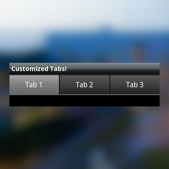
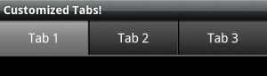
Here’s our final product:
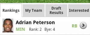
Another example using images instead of color gradients:
Step 6: Download source
Feel free to download and browse the source code for this example here: http://code.google.com/p/android-custom-tabs/
You May Also Enjoy

Android Performance Improvements for SlideshareA post I co-wrote on the LinkedIn Engineering Blog that documents the... |
Fragments, Tab Adapter, and Different LayoutsWhen using Fragments in tabs, the FragmentManager takes care of insta... |